WORK : EVENT BRANDING
Channel Islands Surfboards | Demo Tour 2016


For the 2016 Channel Islands Surfboards Demo Tour, I again developed a new campaign look, this time taking the visual language in a looser, more expressive direction. The California tour traveled through surf communities from San Diego and Orange County to Santa Cruz, San Francisco, and Marin, promoting new Channel Islands board models along the way.
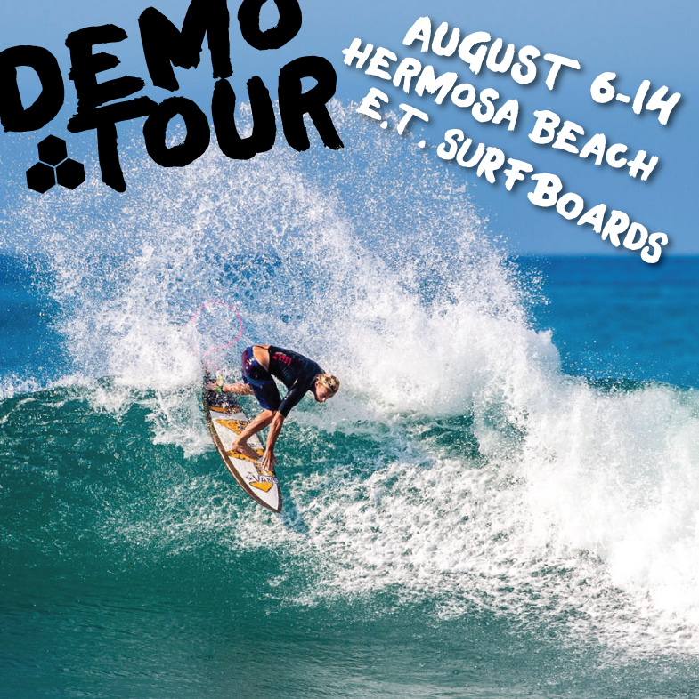
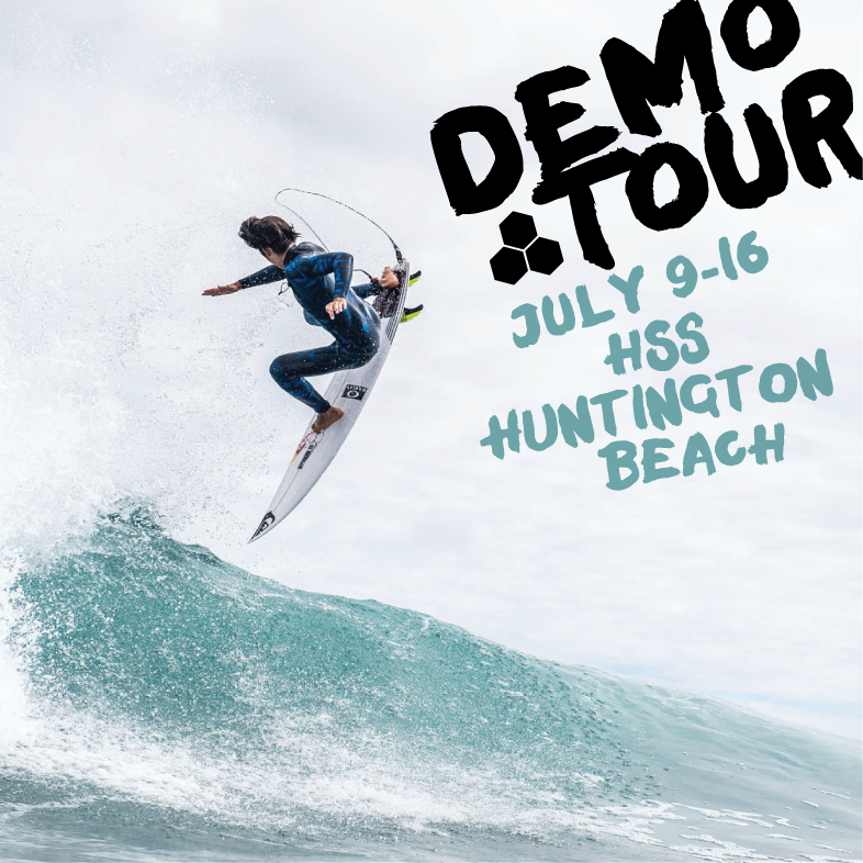
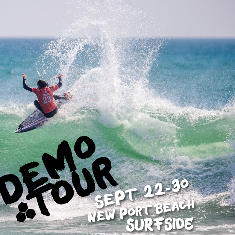
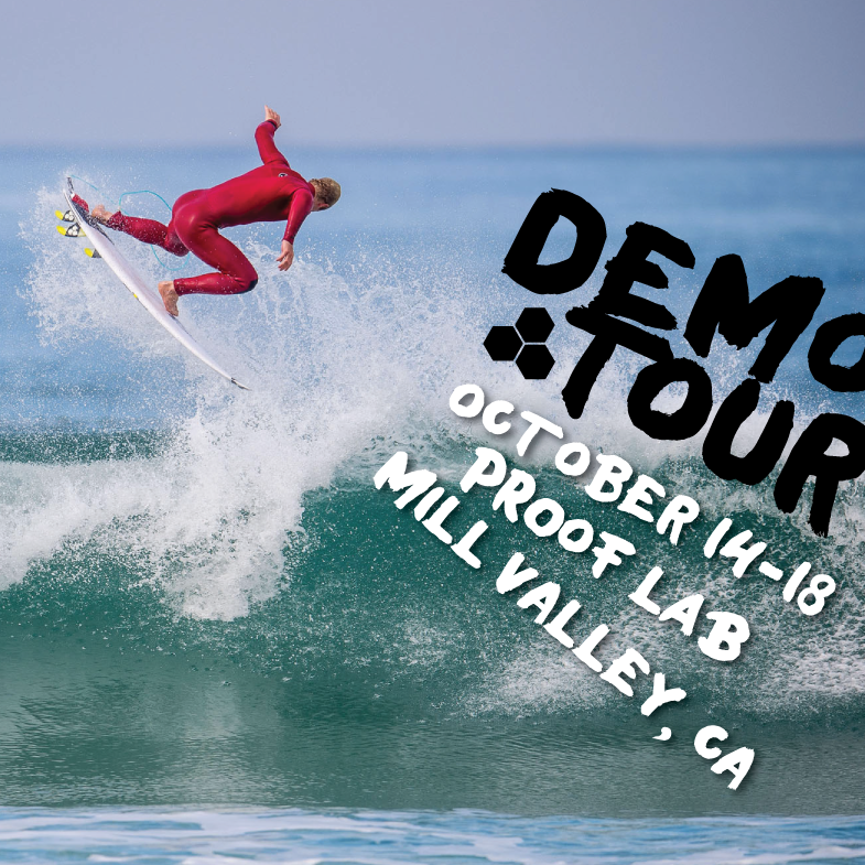
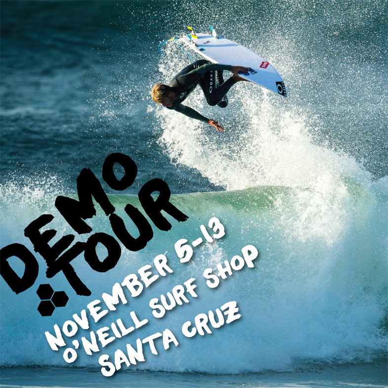
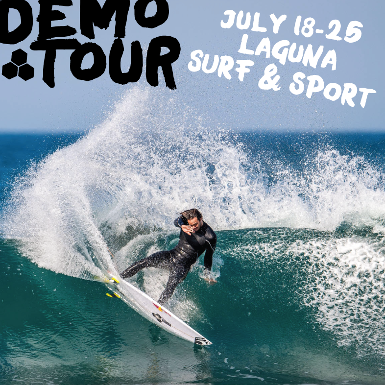
The design pairs full-bleed action surf photography with oversized, hand-painted typography, creating a raw, spontaneous quality that feels closely connected to surf culture. Black brush lettering, hand-drawn white type, and restrained blue accents allow the photography to remain dominant while giving the campaign a distinctive voice of its own.
The identity was adapted across the tour poster, web banners, and individual event graphics for stops throughout California. Each piece uses different surf photography and composition while the expressive typography creates a consistent thread, resulting in an event branding system that feels energetic, flexible, and recognizably Channel Islands without repeating the visual approach of earlier tours.