WORK : PACKAGING
Diageo | The Club | Label Design

BEFORE
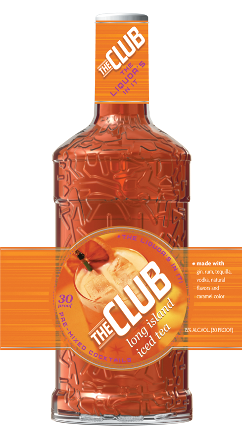
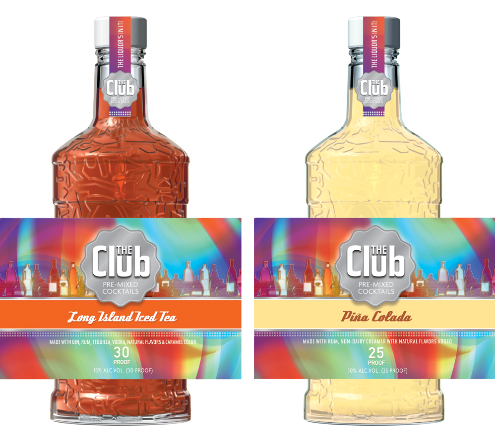
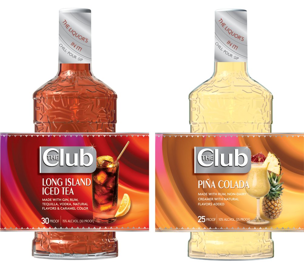
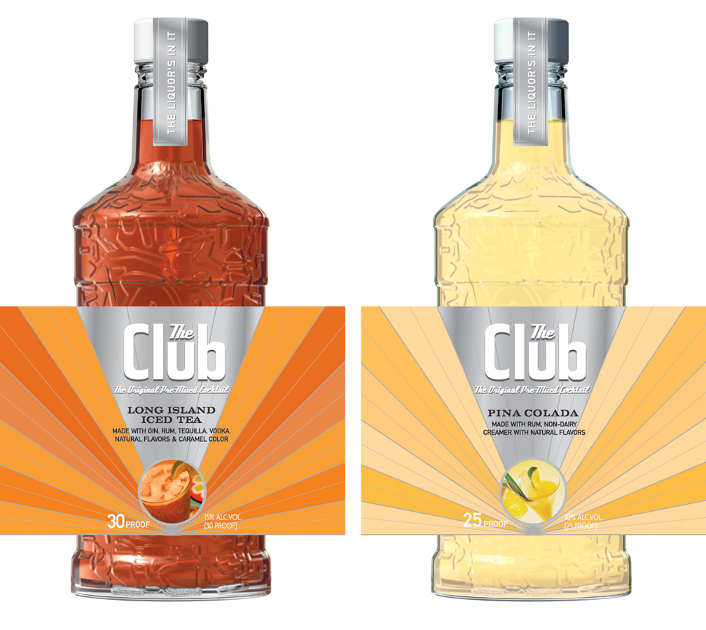
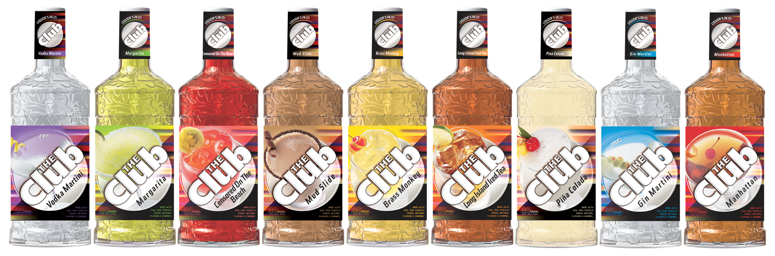
The Club was a line of pre-mixed cocktails from Diageo that had evolved with two different label designs in the market, creating an inconsistent visual presence across the product line. The challenge was to bring the range together while preserving recognizable elements from both existing designs.
My team explored a range of label redesign concepts using old and new logotypes, angled compositions, appetizing product photography, black as a unifying brand color, and color coding to distinguish individual flavors.
The final design combined the strongest equities from the previous packaging—the angled layout and logotype from one version with the black background from the other—to create a more cohesive, modern label system with clearer brand recognition across the line.