
WORK : PACKAGING
Poparazzi Kettlecorn | Package Design
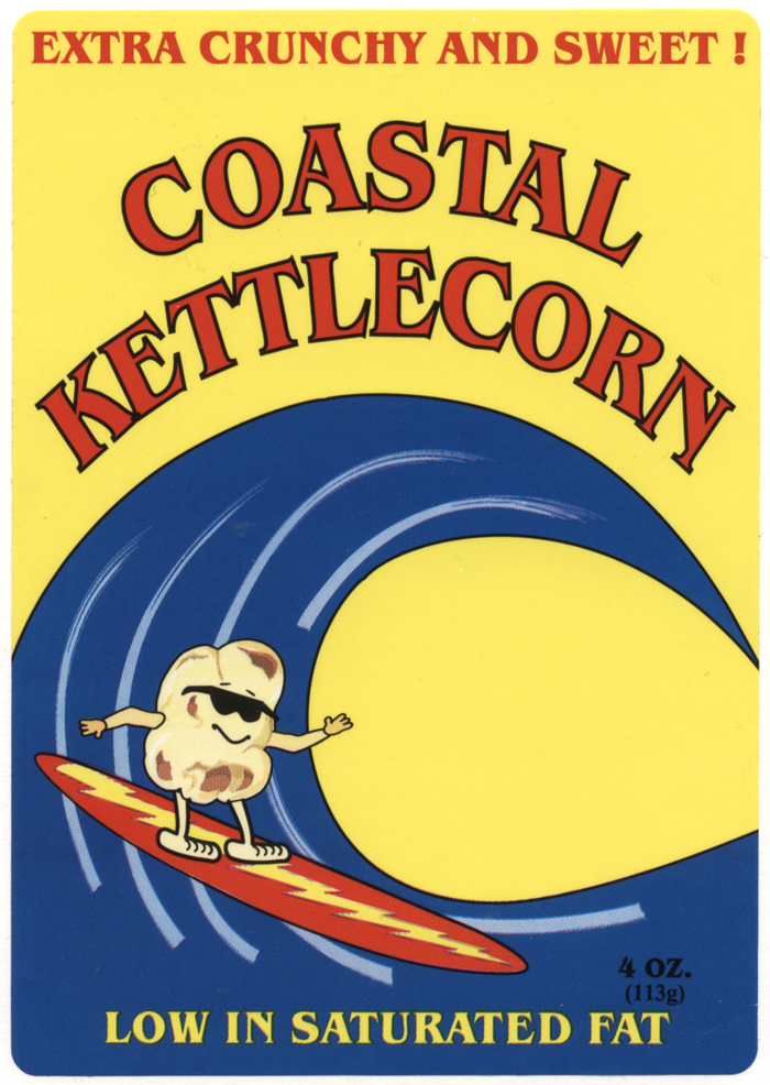
Package label design BEFORE
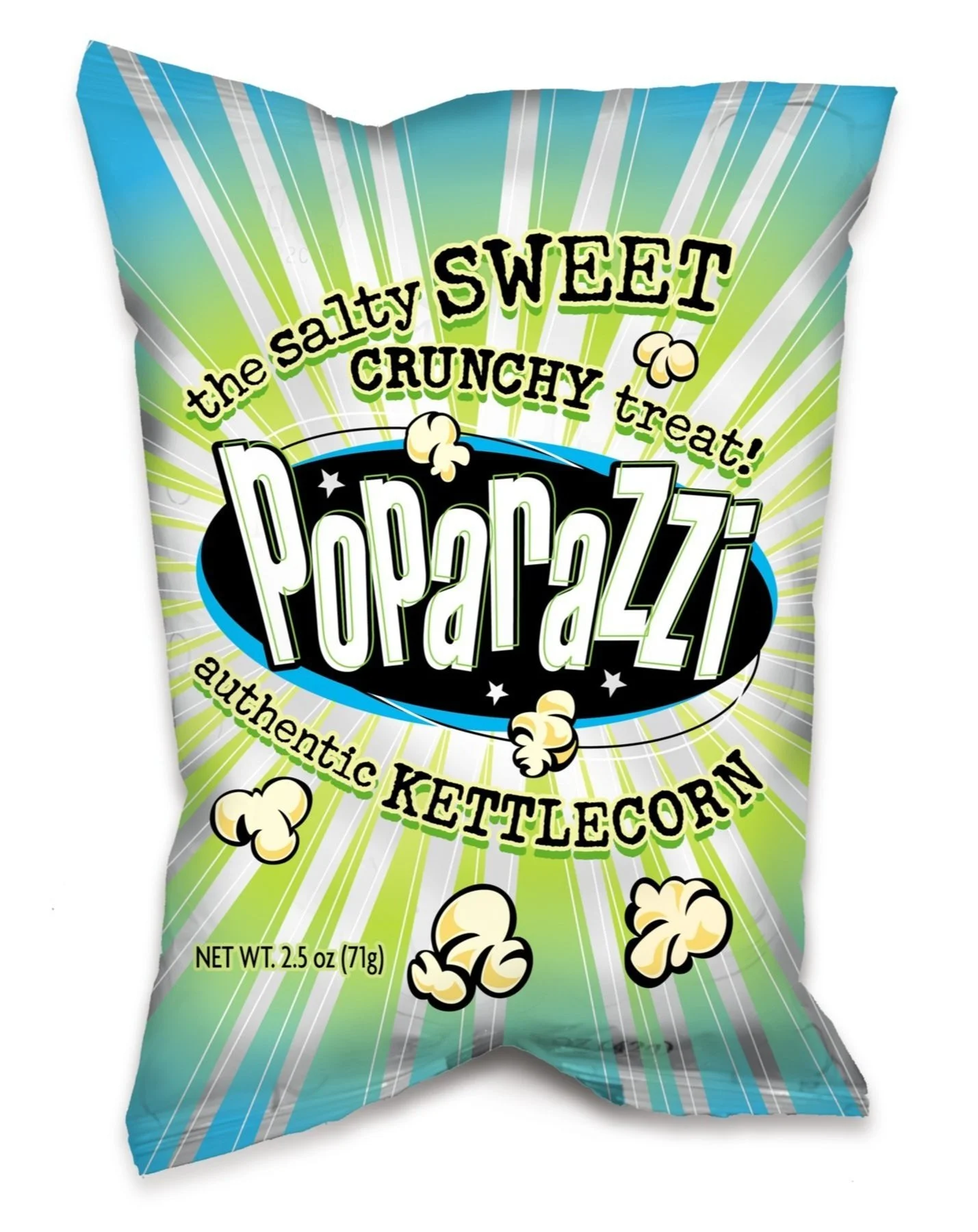
Poparazzi Kettlecorn is a Southern California snack brand known for its salty-sweet popcorn. After rebranding under the Poparazzi name, the company needed packaging that felt more distinctive, energetic, and reflective of the product’s unexpectedly decadent flavor.
I redesigned the package to create a stronger shelf presence and a more memorable connection to the new brand name. Bold graphics and a burst-like composition help convey flavor and energy, while the design was built specifically to take advantage of the foil bag substrate, allowing reflective areas to shine through the artwork.
That reflective effect also creates a subtle light-bulb reference, reinforcing the playful Poparazzi identity while giving the package added dimension and visual impact. The result was a snack package that felt more polished, more distinctive, and better equipped to compete at retail.
After three months of extensively researching graphic design firms in the country, I chose Bonfilio Design. As a client, I was very demanding, but Bonfilio was always easy to work with. Their creative talents for developing visually stimulating materials are superior. My distributors recommended it to 750 stores purely based on the package design. Working with Bonfilio was a positive experience with great results. – Dennis O’Connell, Poparazzi