
WORK: LOGOS / IDENTITIES
The Write Cure | Logo Redesign & Brand Refresh
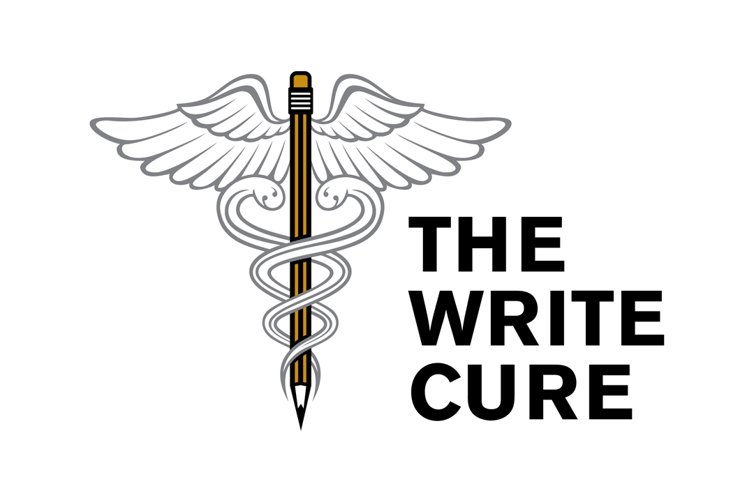
The Write Cure, founded by copywriter and content consultant Anya Sage, provides writing, editing, and marketing communications services, with particular expertise in B2B technology and content marketing.
The existing logo already had a strong conceptual foundation: a medical caduceus reimagined around a pencil, connecting the company name with the idea of diagnosing, refining, and improving written communication. Rather than replacing that concept, I focused on strengthening it.
I redrew the illustration with cleaner, smoother lines and a softer, more approachable character, while preserving the recognizable wings, snakes, and pencil at the center of the mark. I also replaced the original logotype with a bolder, more timeless typeface and stacked the words to create a more compact configuration that remains readable at smaller sizes.
The result is a polished logo redesign and brand refresh that keeps the wit and meaning of the original idea while giving The Write Cure a cleaner, more professional, and versatile visual identity.

BEFORE